Sunday, March 9, 2014
Saturday, February 22, 2014
Something I'm developing:
I finally managed to piece all the right elements of maps I've been making over the years into one cohesive whole. Here is my age of Mirrors:
More info on the specific regions coming soon!
Update:
Finished version:
High res version here: High Res
I finally managed to piece all the right elements of maps I've been making over the years into one cohesive whole. Here is my age of Mirrors:
More info on the specific regions coming soon!
Update:
Finished version:
High res version here: High Res
I'm going to start posting a lot of my art and various projects here. I recently started a career program in game design and I've been able to be a lot more productive artistically. My stuff now is unfortunately kind of crappy, but hey, I'm learning. Hopefully in a year's time this will all improve.
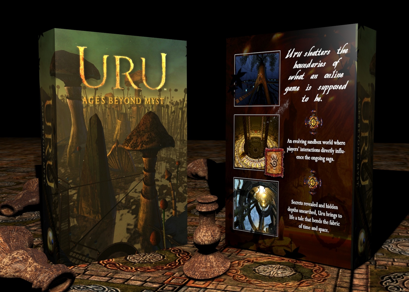
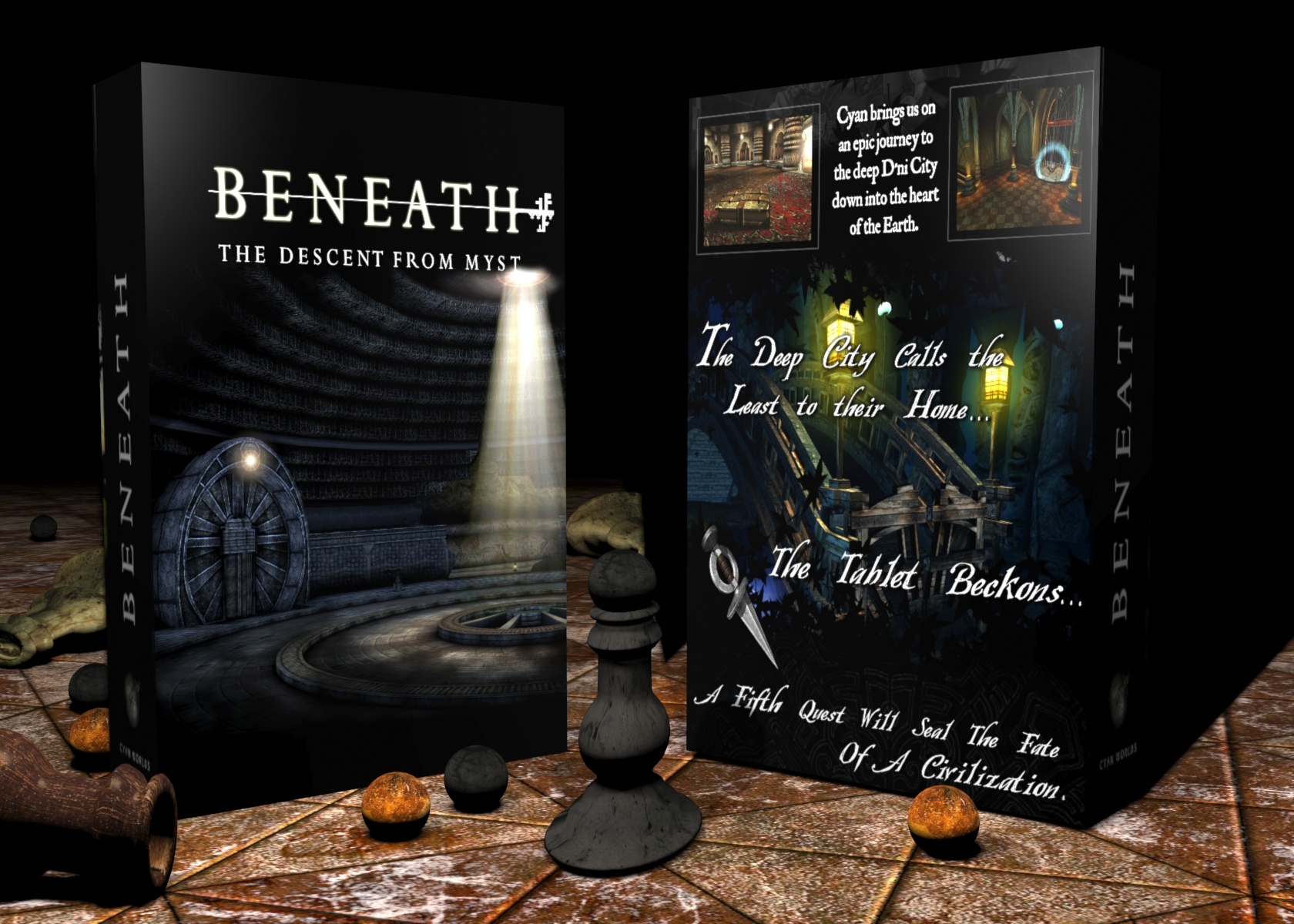
Right now I'll leave you with my fantasy Myst box art that I worked on in a frenzy over four days:
This was made because I HATED - absolutely loathed - the marketing decisions behind Myst IV: Revelation. To give you an example, here is the original box art:
White is really not a very striking color, nor does it evoke Mystery at all. The white is very bland and unattractive, especially coupled with the fade effect. Secondly, why is the name Myst bigger than the title of the actual game? I would assume having Revelation as the dominant text with a subtle Myst IV above or beneath would draw people in. I feel that this logo only serves to remind people of the original game, which unfortunately is a poor choice. Is Skyrim named ARENA: TES V: Skyrim? No, because it would only de-emphasize the importance and artistic vision of the current sequel. My rule of thumb is, always treat a sequel like its the first and best game of the franchise.
Eventually, I said scratch everything about Myst IV: it needs a new title, a new look, and a fresh vision, which inspired me to make my Dream concept. Why Dream? Because the entire Dream element of the game is the center of the game's story. Dream is what allows the player to revisit the brother's story and ultimately save Yeesha. It would have been really neat had they turned Dream into an actual game environment. They could have made it a surreal, dream-like landscape. Think of Star Trek: Generations' Nexus world. That kind of thing. I think anchoring the game on an artistic or conceptual story element like this would have really given Myst IV a "raison d'etre". Instead, Myst IV feels unfocused, as if separate teams developed each age individually (which, unfortunately they did. (I have insider info))
I still to this day don't even know who the Art Director for Revelation was, mostly because in all other Myst titles, it's plainly obvious. You could never mistake Robyn Miller's whimsy or Vander Wende's anthropological-gothic for anyone else but themselves The same applies to Ron Lemen and Phil Saunder's vibrant, organic style used in Exile, or Stephan Martiniere's hectic sci-fi in Uru or End of Ages. Those games felt like they were saying something.
Moving on:
This is my ideal fantasy version of Uru. No ABM, no Uru Live, no Myst Online: Uru Live (possibly the most confusing and cumbersome title I've ever heard). Just Uru: Ages Beyond Myst. It has a ring to it. Simple, like World of Warcraft or ArcheAge. No need to explain. Teledahn never gets any love, which is especially disheartening because I think its the best age in Uru. It has the most personality and the best gameplay (perhaps barring Ahnonay).
For Myst V, I really wanted to emphasize the journey to D'ni. Had Cyan had more time and resources, I think the entire D'ni cavern and the journey to its heart would have made a great Myst game at the same level as or even on an even larger scope than Riven. I wanted a blue/black box since my other two were quite warm in tone. I tried to alternate the colors with each sequel. Myst was greenish, Riven was blue/ Exile was light blue/yellow/green, then my Myst IV would have to be orange to stand out. With Beneath I decided to go cool so as to differentiate from my Dream box.
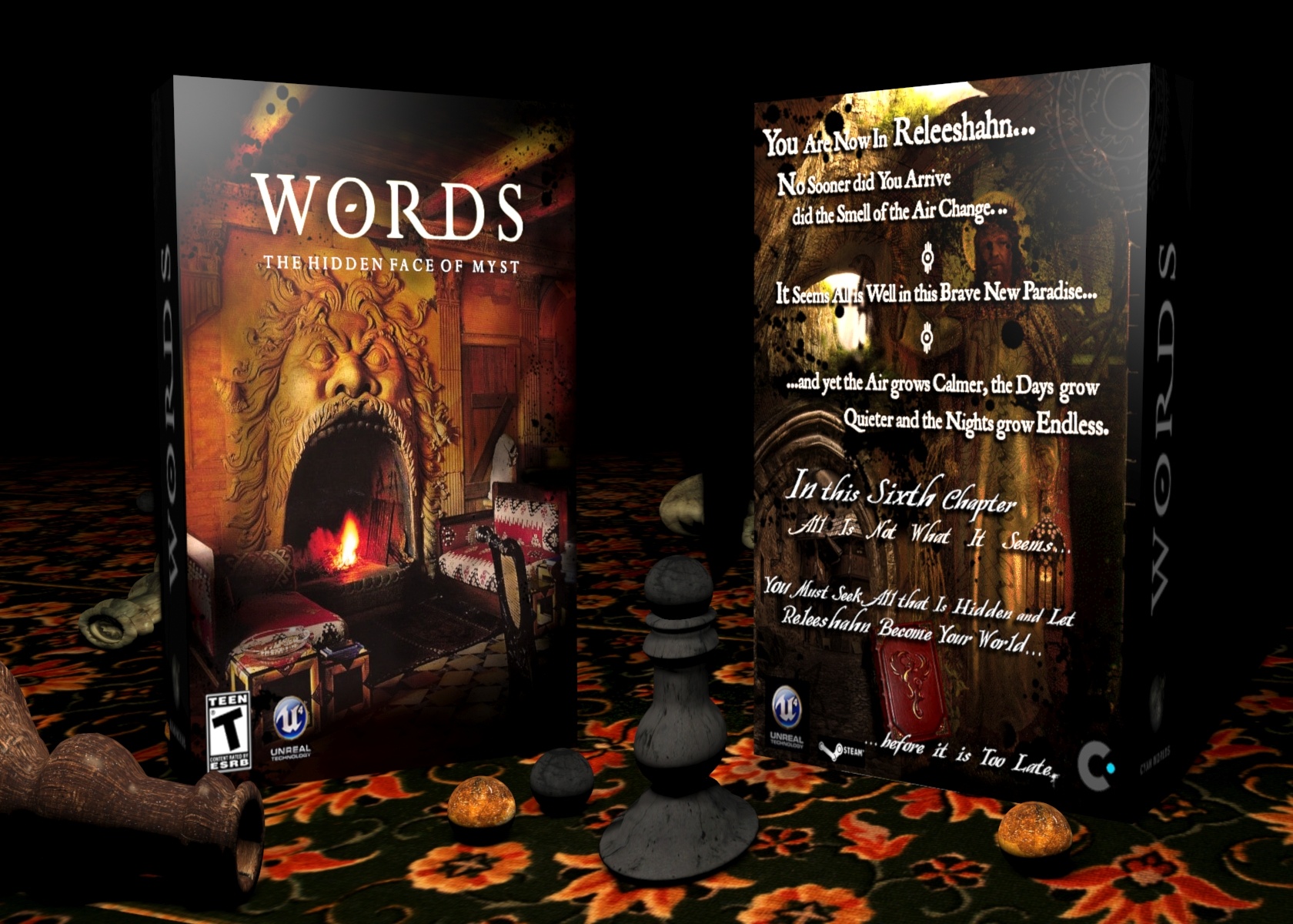
My Myst VI box. Oh boy, was this like pulling teeth.
I've always had an idea of what Releeshahn should look like, probably since Exile. I imagine a lush romantic age (as in the movement )filled with gardens and beautifully carved civic buildings. Perhaps a tad rainy. I mostly drew my inspiration from late 18th Century and early to mid 19th Century painting.
The difficult task was to mesh all those elements into something that was cohesive and had distinctive flair. I also wanted to subtly hint at a growing threat (i.e the Bahro war) through the imagery and text. I finally chose the face photograph as it just seemed to posses the most traditionally Myst-like element of the unsettling. The back however had to showcase more, so I layered all the most evocative imagery I could find that reflected my vision of Releeshahn. Stone arches, green landscapes and finally my interpretation of "King Atrus". I borrowed a pre-Raphaelite painting of Jesus holding a lamp and blended in Rand Miller's face. The funny thing is that I've always pictured that specific painting as evoking a scene from Releeshahn. It was great to finally make use of it.
Oh, and here is the alternate box:
Right now I'll leave you with my fantasy Myst box art that I worked on in a frenzy over four days:
This was made because I HATED - absolutely loathed - the marketing decisions behind Myst IV: Revelation. To give you an example, here is the original box art:
White is really not a very striking color, nor does it evoke Mystery at all. The white is very bland and unattractive, especially coupled with the fade effect. Secondly, why is the name Myst bigger than the title of the actual game? I would assume having Revelation as the dominant text with a subtle Myst IV above or beneath would draw people in. I feel that this logo only serves to remind people of the original game, which unfortunately is a poor choice. Is Skyrim named ARENA: TES V: Skyrim? No, because it would only de-emphasize the importance and artistic vision of the current sequel. My rule of thumb is, always treat a sequel like its the first and best game of the franchise.
Eventually, I said scratch everything about Myst IV: it needs a new title, a new look, and a fresh vision, which inspired me to make my Dream concept. Why Dream? Because the entire Dream element of the game is the center of the game's story. Dream is what allows the player to revisit the brother's story and ultimately save Yeesha. It would have been really neat had they turned Dream into an actual game environment. They could have made it a surreal, dream-like landscape. Think of Star Trek: Generations' Nexus world. That kind of thing. I think anchoring the game on an artistic or conceptual story element like this would have really given Myst IV a "raison d'etre". Instead, Myst IV feels unfocused, as if separate teams developed each age individually (which, unfortunately they did. (I have insider info))
I still to this day don't even know who the Art Director for Revelation was, mostly because in all other Myst titles, it's plainly obvious. You could never mistake Robyn Miller's whimsy or Vander Wende's anthropological-gothic for anyone else but themselves The same applies to Ron Lemen and Phil Saunder's vibrant, organic style used in Exile, or Stephan Martiniere's hectic sci-fi in Uru or End of Ages. Those games felt like they were saying something.
Moving on:
This is my ideal fantasy version of Uru. No ABM, no Uru Live, no Myst Online: Uru Live (possibly the most confusing and cumbersome title I've ever heard). Just Uru: Ages Beyond Myst. It has a ring to it. Simple, like World of Warcraft or ArcheAge. No need to explain. Teledahn never gets any love, which is especially disheartening because I think its the best age in Uru. It has the most personality and the best gameplay (perhaps barring Ahnonay).
For Myst V, I really wanted to emphasize the journey to D'ni. Had Cyan had more time and resources, I think the entire D'ni cavern and the journey to its heart would have made a great Myst game at the same level as or even on an even larger scope than Riven. I wanted a blue/black box since my other two were quite warm in tone. I tried to alternate the colors with each sequel. Myst was greenish, Riven was blue/ Exile was light blue/yellow/green, then my Myst IV would have to be orange to stand out. With Beneath I decided to go cool so as to differentiate from my Dream box.
My Myst VI box. Oh boy, was this like pulling teeth.
I've always had an idea of what Releeshahn should look like, probably since Exile. I imagine a lush romantic age (as in the movement )filled with gardens and beautifully carved civic buildings. Perhaps a tad rainy. I mostly drew my inspiration from late 18th Century and early to mid 19th Century painting.
The difficult task was to mesh all those elements into something that was cohesive and had distinctive flair. I also wanted to subtly hint at a growing threat (i.e the Bahro war) through the imagery and text. I finally chose the face photograph as it just seemed to posses the most traditionally Myst-like element of the unsettling. The back however had to showcase more, so I layered all the most evocative imagery I could find that reflected my vision of Releeshahn. Stone arches, green landscapes and finally my interpretation of "King Atrus". I borrowed a pre-Raphaelite painting of Jesus holding a lamp and blended in Rand Miller's face. The funny thing is that I've always pictured that specific painting as evoking a scene from Releeshahn. It was great to finally make use of it.
Oh, and here is the alternate box:
Not sure which one I like more.
Monday, October 21, 2013
The Myst Ages: From Best to Worst (A Design Study)
When it comes to the Myst series, design is a primary focus. The visual art of the games' many environments has come to define the experience of Myst. From surreal to rigid, spartan to ornate, the ages we explore in Myst are diverse in their design and setup.
Which ones were the best? Which ones were the worst? How did these ages stand as an experience unto themselves in the Myst canon? Here is my personal opinion of what ages stood out the most for me, beckoning me to revisit them, and those that gave me a quite "meh" feeling after completing them.
1. Riven
This one was undoubtedly the one. The whole game of Riven takes place, minus the other two small ages, on this large age. Its what I would describe as the Myst open world sandbox experience.
One really gets a feel for this place when playing Riven as the player is swept up in the culture, rich aesthetic, religion and history of the age. The age is divided into the five islands of Temple, Prison, Jungle, Survey and Boiler island, each with their own characteristic. When I first played Riven I noticed how each island in many ways paralleled the Ages from the original Myst. Survey was Stoneship, Jungle was Channelwood, Temple was Mechanical and Boiler was Selenitic.
This is all due to the primary design elements that each island focuses on. Survey is that eerie, surreal one that evokes feelings or memories of things that never were, much in the same way Stoneship evokes various themes and images from distant memories and places. This is shown by how the ship and lighthouse evoke possible tales or visual themes of sea travel as depicted in Romantic literature and painting, or how the grey sky evokes sadness, as in perhaps this remote group of isles was once a stop for distant sailors, but has since been forgotten. I digress, but Survey Island holds much of these similar design elements of oddness and reference. The spikes on the top tier of the island appear like a surreal sculpture that has no purpose except giving the viewer a sense of beauty and wonder. Meanwhile, beneath it, the red room visually references the Roman pantheon, only dimly lit in dark sumptuous red lighting. The wahrk tusks in each alcove suggest plunder (of the age of Riven) and elude to the history of colonialism in the Romantic era, as depicted in much of the art from the era. The water itself is strangely mysterious and the golden elevator which rises from the pool, with the pull of a lever, is foreboding beacon of beauty and terror all at once. The lower corridor reminds one of victorian industrialism, as if one was at a nascent train station in the 1870s with the artful iron work that frames the player's path.
Next we come to the red tunnel, which to me at least, evokes memories of deep tunnels under ruins, possibly Egypt, as seen through the eyes of a Romantic painter (possibly working for the Napoleonic missions in Egypt) . This aesthetic can even be seen in the likes of Tintin which glorifies adventure and discovery of a sublimely Romanticised east in such volumes as Les Cigars Du Paraoh or Le Crab au Puces D'Ors. In the blue Wahrk room we switch gears to Jules Vernes and we are reminded us of 20 000 Leagues Under the Sea, or yet again, Tintin in Le Tresor de Rackham Le Rouge - bringing us to the fantastical world of Mysterious sea exploration. Gehn's chair is akin to a submarine captain's piloting seat overlooking the depths of an ocean while the rotating viewer that the player lowers recalls a large nautical stearing wheel. Survey island is chok full of aesthetic references. On the top tier of the island, the giant dagger suspended by chains reminds me of the prow of a ship stuck in rock. Sound familiar? Yes, good ole Stoneship!
Interestingly enough, this was Robyn's favorite island in Riven. I can definitely see a trend in his stylistic tastes - he seems fascinated by an almost subconscious aesthetic dealing with memory; things that seem familiar but aren't entirely. This is a trend which I observe in all of his art. Check out his www.tinselman.com website to see what I mean.
Jungle Island is the real heart of the age,. This is where we find the adobe hut village, the lake, the jungle itself, the sunners, the schoolhouse, gallows and Moeity tunnels. So much visual meat to digest! Really, this is where Richard Vander Wende really shines. Where Myst had an almost nostalgic quality to it, Vander Wende brings his harsh, strange realism to the table. The place feels lived in. The huts are not referencing medieval Europe or even tribal Africa, they are their own original anthropological study. Familiar, yes, but not referential. Take that Skyrim! (Seriously though, I'm a big Skyrim fan too) This applies to a lot of Riven's design, even Gehn's areas which are distinctively D'ni. The series at this point is avoiding parallels with real world cultures and Cyan opts instead to develop its own unique aesthetic rules that, although based in nature and math, do not immediately conjure up images entire real world cultures. Bits and pieces are used in the design process but rather it seems that Cyan almost broke down the rules of form and reassembled them from the ground up in familiar, yet altogether distinctively different way.
Subscribe to:
Posts (Atom)