I'm going to start posting a lot of my art and various projects here. I recently started a career program in game design and I've been able to be a lot more productive artistically. My stuff now is unfortunately kind of crappy, but hey, I'm learning. Hopefully in a year's time this will all improve.
Right now I'll leave you with my fantasy Myst box art that I worked on in a frenzy over four days:
This was made because I HATED - absolutely loathed - the marketing decisions behind Myst IV: Revelation. To give you an example, here is the original box art:
White is really not a very striking color, nor does it evoke
Mystery at all. The white is very bland and unattractive, especially coupled with the fade effect. Secondly, why is the name
Myst bigger than the title of the actual game? I would assume having
Revelation as the dominant text with a subtle
Myst IV above or beneath would draw people in. I feel that this logo only serves to
remind people of the original game, which unfortunately is a poor choice. Is Skyrim named
ARENA: TES V: Skyrim? No, because it would only de-emphasize the importance and artistic vision of the current sequel. My rule of thumb is, always treat a sequel like its the first and best game of the franchise.
Eventually, I said scratch everything about Myst IV: it needs a new title, a new look, and a fresh vision, which inspired me to make my Dream concept. Why Dream? Because the entire Dream element of the game is the center of the game's story. Dream is what allows the player to revisit the brother's story and ultimately save Yeesha. It would have been really neat had they turned Dream into an actual game environment. They could have made it a surreal, dream-like landscape. Think of Star Trek: Generations' Nexus world. That kind of thing. I think anchoring the game on an artistic or conceptual story element like this would have really given Myst IV a "raison d'etre". Instead, Myst IV feels unfocused, as if separate teams developed each age individually (which, unfortunately they did. (I have insider info))
I still to this day don't even know who the Art Director for Revelation was, mostly because in all other Myst titles, it's plainly obvious. You could never mistake Robyn Miller's whimsy or Vander Wende's anthropological-gothic for anyone else but themselves The same applies to Ron Lemen and Phil Saunder's vibrant, organic style used in Exile, or Stephan Martiniere's hectic sci-fi in Uru or End of Ages. Those games felt like they were
saying something.
Moving on:
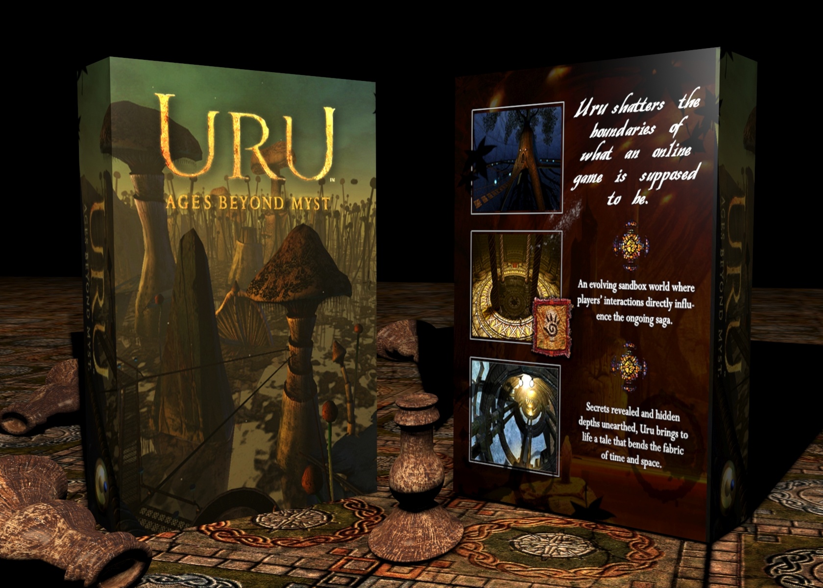
This is my ideal fantasy version of Uru. No ABM, no Uru Live, no Myst Online: Uru Live (possibly the most confusing and cumbersome title I've ever heard). Just Uru: Ages Beyond Myst. It has a ring to it. Simple, like World of Warcraft or ArcheAge. No need to explain. Teledahn never gets any love, which is especially disheartening because I think its the best age in Uru. It has the most personality and the best gameplay (perhaps barring Ahnonay).
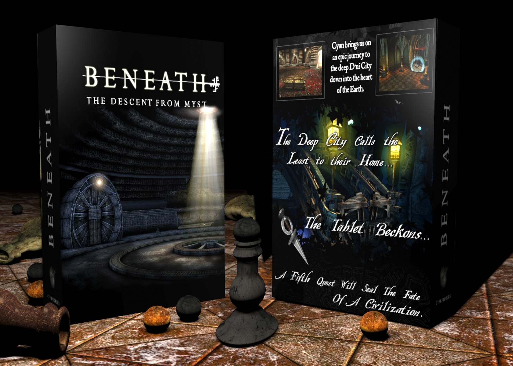
For Myst V, I really wanted to emphasize the journey to D'ni. Had Cyan had more time and resources, I think the entire D'ni cavern and the journey to its heart would have made a great Myst game at the same level as or even on an even larger scope than Riven. I wanted a blue/black box since my other two were quite warm in tone. I tried to alternate the colors with each sequel. Myst was greenish, Riven was blue/ Exile was light blue/yellow/green, then my Myst IV would have to be orange to stand out. With
Beneath I decided to go cool so as to differentiate from my
Dream box.
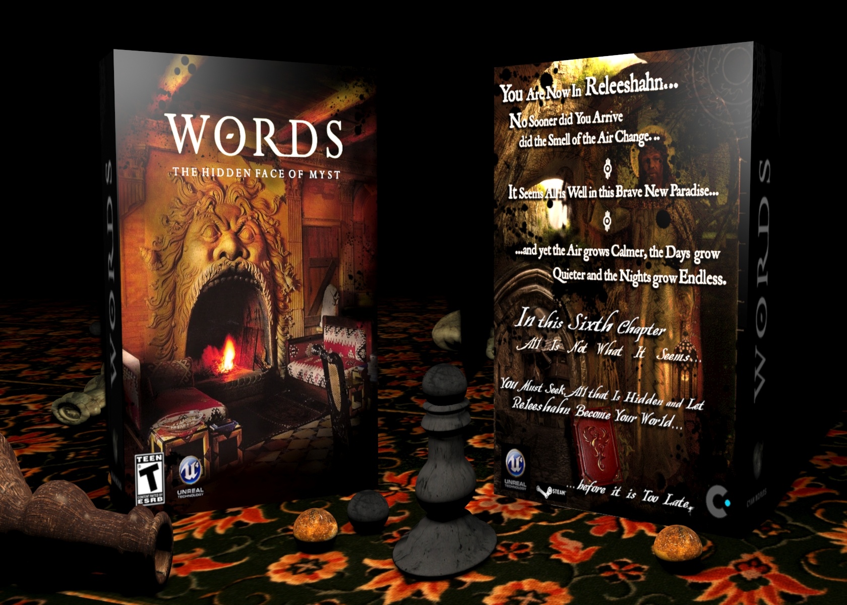
My Myst VI box. Oh boy, was this like pulling teeth.
I've always had an idea of what Releeshahn should look like, probably since Exile. I imagine a lush romantic age (as in the movement )filled with gardens and beautifully carved civic buildings. Perhaps a tad rainy. I mostly drew my inspiration from late 18th Century and early to mid 19th Century painting.
The difficult task was to mesh all those elements into something that was cohesive and had distinctive flair. I also wanted to subtly hint at a growing threat (i.e the Bahro war) through the imagery and text. I finally chose the face photograph as it just seemed to posses the most traditionally Myst-like element of the unsettling
. The back however had to showcase more, so I layered all the most evocative imagery I could find that reflected my vision of Releeshahn. Stone arches, green landscapes and finally my interpretation of "King Atrus". I borrowed a pre-Raphaelite painting of Jesus holding a lamp and blended in Rand Miller's face. The funny thing is that I've always pictured that specific painting as evoking a scene from Releeshahn. It was great to finally make use of it.
Oh, and here is the alternate box:
Not sure which one I like more.